
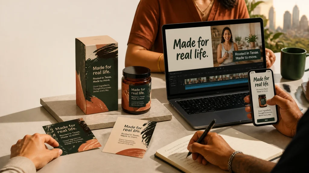
A strong brand launch is not three separate projects.
It is one connected system.
Your packaging should make the product feel legitimate. Your Shopify store should explain the product quickly and make buying easy. Your videos should carry the same visual language into the social feed, where attention is earned one second at a time.
That connection is the focus of this August 2026 entry in the Mk5 Studios Highlight Reel series. We are looking at one anonymized consumer product brand preparing to launch across Texas: and the design decisions that helped turn a collection of assets into a credible customer experience.
The larger lesson? Typography, web performance, AI-answer readiness, and human-led video all work better when they are planned together.
1. The Brief: Build Recognition Before the Launch
The brand was a growing consumer packaged goods company preparing to sell online throughout Houston, Dallas, Austin, and surrounding Texas markets.
The team needed:
- A clear visual identity for packaging and labels
- A Shopify store that worked well on mobile
- Product pages that answered real customer questions
- Short-form videos for social media and paid campaigns
- A system that could scale without constant redesign
What did they not need?
More decoration.
They needed validation. A customer should see the package, visit the store, and watch a product video without feeling like they had moved between three unrelated brands.
That is where our process began: not with a mood board, but with the customer’s experience.
What must someone understand in five seconds? What concerns might stop them from buying? Which claims need proof? How can the brand feel distinctive without becoming difficult to read?
These questions gave us a practical creative direction.
2. Highlight One: Typography Became the Brand’s First Voice
In 2026, typography-first design is more than a visual trend. It is a strategic response to crowded markets and automated sameness.
When every startup can generate a quick logo or visual concept, a disciplined type system helps your business sound and look intentional.
For this consumer product brand, we limited the system to two typefaces:
- One expressive display face for packaging names, campaign headlines, and short-form video hooks
- One highly legible sans-serif for product details, ingredients, navigation, labels, and longer copy
That constraint created clarity. It also made the brand easier to manage across packaging, digital ads, email graphics, and the Shopify interface.

Why use only two typefaces?
Because too many fonts create visual noise. They make a young brand look undecided.
A tight type scale does the opposite. It tells the customer what matters first, what supports the decision, and what can wait. We also planned for readable 16–18px body text, strong contrast, generous spacing, and clear hierarchy.
That matters on a label. It matters even more on a phone.
Expressive type still had a role. We used it where emotion and recognition were valuable. But we kept body copy calm and accessible. A playful headline can create emotional connection; readable supporting text protects comprehension.
Do not stress! Accessibility-by-design does not mean your brand has to look bland. It means personality should be applied where it helps: not placed in every corner simply because the software allows it.
For startups, this is one reason to work with a thoughtful branding agency for startups. You are not just selecting fonts. You are deciding how your business will be recognized, understood, and trusted.
That is the difference between decoration and legitimacy.
3. Highlight Two: The Shopify Store Was Designed to Be Used: and Cited
A beautiful store is not enough.
Your customer must be able to find the product, understand its value, verify important details, and complete the purchase without friction. Meanwhile, search engines and AI answer engines need enough clear, accessible information to understand what your business offers.
That is why the store was planned around three ideas: answer-first content, performance-first development, and frictionless product pages.
Answer-first content
Google’s guidance for AI features in Search makes one point especially important: there is no magic “AI Overview” markup that guarantees visibility. AI Overviews use the standard Search index and standard SEO fundamentals.
Be wary of anyone claiming they can guarantee that your business will appear in an AI answer.
Instead, make your important pages easier to understand.
For the product brand, we organized the product story around real customer questions:
- What is the product?
- Who is it for?
- How should it be used?
- What makes it different?
- What ingredients or materials does it contain?
- Where can customers buy it?
- What should a first-time customer expect?
Each section began with a direct answer before adding supporting detail. We used real HTML text: not text baked into images: so the content remained readable to customers, assistive technologies, and crawlers.
We also recommended appropriate Article and FAQ structured data, accurate author and organization information, and first-hand explanations based on the brand’s actual product knowledge.
Do not hide useful content behind images. Do not accidentally use noindex or nosnippet on pages you want discovered. Verify every claim, especially health, performance, ingredient, and comparative claims.
The goal is not to “write for robots.” The goal is to make the page so clear that both people and machines can identify the answer.
Performance-first Shopify website design
The store was designed mobile-first because that is where many customers will encounter it. Product visuals were optimized. Unnecessary scripts were reduced. Layout shifts were controlled. Calls to action were placed where a thumb could reach them comfortably.

The product page functioned as a small landing page rather than a bare catalog listing. It led with:
- Product name and primary benefit
- Clear imagery and mobile-friendly media
- Price and variant information
- A visible purchase action
- Short benefit-focused copy
- Deeper product details below
- Trust-building information and social proof
We also considered purposeful micro-interactions. A button can confirm that an item was added to the cart. A filter can respond smoothly. A product image can transition without distracting from the purchase decision.
Use motion to clarify. Do not use it merely to show off.
Mk5 Studios approaches custom website design services in Houston with that balance in mind: beauty and functionality, without waste or obsessive tweaking. Every decision should support usability, speed, or confidence.
That is how a digital storefront earns legitimacy before the customer ever reaches checkout.
4. Highlight Three: AI Assisted the Edit, but Humans Led the Story
The video plan called for short-form product content between 15 and 60 seconds. The footage was designed to feel natural: hands using the product, simple demonstrations, brief explanations, and creator-style moments that could live comfortably on TikTok, Instagram Reels, and similar feeds.
AI-supported tools helped with the repetitive work:
- Finding usable moments in longer footage
- Creating an initial cut
- Removing filler
- Generating caption drafts
- Reframing footage for vertical viewing
- Producing alternate versions for testing
But the first draft was not the final story.
A human editor still had to decide where the hook should begin, when a pause created trust, whether a claim was accurate, and whether the pacing felt authentic rather than artificially frantic.

Captions, color, and motion carried the brand system
Captions were treated as essential, not optional. Many viewers watch social content with sound muted, and inaccurate captions can damage both accessibility and consumer confidence.
We checked:
- Product names and technical terms
- Punctuation and timing
- Caption contrast
- Safe placement for mobile interfaces
- Readability against the footage
Color grading gave the product footage a consistent visual environment. Skin tones remained natural. Product colors stayed accurate. Different clips felt like they belonged to the same campaign.
Motion graphics services added restraint rather than clutter. A logo animation, benefit callout, or simple product-use diagram could reinforce the message without overwhelming the viewer.
This is the practical value of video editing services for business: not merely making footage look polished, but protecting the meaning inside it.
AI can accelerate production. It cannot take responsibility for context, emotional tone, or brand honesty.
If synthetic people, voices, or visuals are used, review the current platform rules and disclose AI involvement when required. TikTok and other major platforms continue to expand labeling expectations for realistic AI-generated content. Transparency is not a weakness. It is part of trust.
5. The Real Highlight: One System Across Three Touchpoints
The packaging, Shopify store, and videos were developed together.
The display typeface from the label became the recognizable headline treatment in social clips. The neutral sans-serif remained readable in product descriptions and captions. The color palette moved from physical packaging to digital buttons and motion graphics. Product claims were reviewed once and then adapted carefully across each channel.
That consistency reduced production friction. It also made the brand easier for customers to remember.
Could someone see a video on a Tuesday, encounter the package in a local store on Friday, and recognize the same company immediately?
That was the test.
A connected creative system helps your marketing material design work harder because each asset supports the others. It also gives your team a reliable foundation for future campaigns, seasonal launches, retail displays, and new product variations.
6. What Your Business Can Take From This Launch
Start with the customer’s questions.
Then build the visual and technical system around answering them.
- Limit your type system. Use two typefaces max unless there is a clear business reason to add more.
- Design for readability first. Keep body text comfortable, contrast strong, and hierarchy obvious.
- Write pages in answer-first sections. Lead with direct explanations, then provide supporting detail and proof.
- Keep real text in the HTML. Do not turn essential information into images or inaccessible visual effects.
- Make mobile performance a design requirement. Compress media, reduce unnecessary scripts, and test the purchase path.
- Use micro-interactions with purpose. Confirm actions and guide attention; never make customers fight the interface.
- Let AI assist production, not replace judgment. Human editors protect accuracy, pacing, emotion, and legitimacy.
- Repurpose intelligently. A strong brand system should move from label to Shopify store to social video without losing its identity.
Your goal is not to chase every trend. Your goal is to remain relevant while giving customers a reason to believe you.
That is validation.
That is legitimacy.
And that is where strategic creative work earns its place in the business.
Ready to Build a More Connected Brand Experience?
Whether you need Shopify website design, a packaging and branding system, marketing material design, or polished video editing and motion graphics, Mk5 Studios can help you connect the pieces.
We are a creative agency in Houston serving businesses across Houston, Dallas, Austin, and throughout the United States.
Contact Mk5 Studios to discuss your website and creative project.