
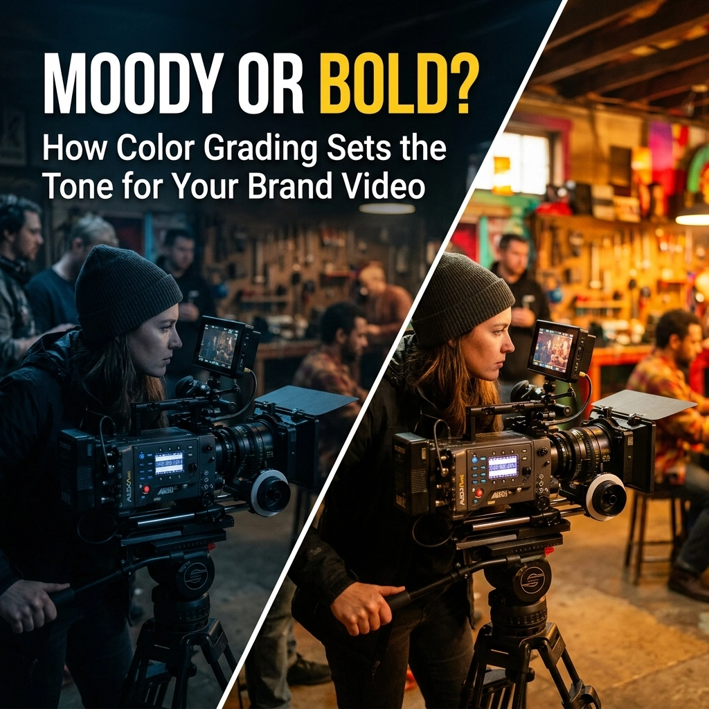
You’ve spent weeks planning the perfect brand video. You hired the talent, nailed the script, and the lighting on set was chef’s kiss. But when you look at the raw footage, something feels… flat. It looks like reality, sure, but it doesn’t feel like a brand.
Welcome to the "uncanny valley" of video production. This is the moment where most business owners panic and think they need to reshoot. Do not stress! It is simpler than you think. The difference between a home movie and a cinematic masterpiece isn’t usually the camera, it’s the color grading.
As we roll through 2026, the visual landscape has shifted. We aren't just looking for "clear" video anymore; we’re looking for a vibe. Whether you’re a startup in Houston or an established creative agency in Dallas, understanding how to manipulate color is your secret weapon for capturing consumer confidence.
What Exactly is Color Grading? (And No, It’s Not Just a Filter)
Before we dive into the trends of 2026, let’s clear up a common misconception. Many people use "color correction" and "color grading" interchangeably. They are not the same thing.
- Color Correction is the technical process of making the footage look "normal." It’s fixing the white balance, ensuring skin tones aren't green, and making sure the shadows aren't swallowed whole. It’s the baseline.
- Color Grading is the artistic choice. This is where we decide if the video feels like a warm summer afternoon or a cold, futuristic tech lab.
Think of color correction as the foundation of a house, and color grading as the interior design. You need the foundation to stay standing, but the interior design is what makes people want to live there. In the world of video editing in Houston, grading is what separates the amateurs from the pros.

The 2026 Palette: Trends You Need to Know
In 2026, we’ve moved past the overly saturated "Instagram look" of the early 2020s. Today’s audience is sophisticated; they want authenticity paired with high-concept art. Here are the two heavy hitters dominating the screens this year:
1. The "Cloud Dancer" Aesthetic
"Cloud Dancer" is the industry term for that ultra-clean, soft, ethereal white palette. It’s not just "bright"; it’s purposeful. It uses soft whites and desaturated pastels to create a sense of purity, transparency, and high-end luxury. If your brand is about wellness, high-tech minimalism, or modern professional services, this is your go-to. It screams "I have my life together."
2. Bioluminescence (The Glow Up)
On the flip side, we are seeing a massive surge in "Bioluminescence." Think deep teals, electric purples, and glowing gradients that look like they were pulled from a deep-sea creature or a futuristic cityscape. This isn't just "neon." It’s about light that feels like it’s emanating from within the frame. It’s energetic, bold, and perfect for tech companies or brands that want to stand out in a crowded social feed.
Moody vs. Bold: Which One Are You?
Choosing between a moody aesthetic and a bold one isn't just about what looks "cool." It’s a strategic business decision. Every color you put on screen triggers a psychological response.
The Moody Aesthetic: Sophistication and Mystery
Moody color grading isn't just "dark." It’s about contrast and intentionality. By using deeper shadows and a more muted palette, you’re asking the viewer to lean in.
- The Vibe: Exclusive, luxury, artistic, and introspective.
- The "Why": It fosters a deeper emotional connection. It tells the viewer, "We have nothing to prove."
- Best For: High-end real estate, legacy financial services, or independent fashion brands.
Be wary of going too dark, though. You want "moody," not "I can't see what you're selling." Professional video editing ensures that even in the shadows, your product remains the star.

The Bold Aesthetic: Energy and Impact
Bold color grading is the loud-hailer of the visual world. It uses highly saturated hues, popping reds, deep blues, and vibrant yellows, to grab the viewer by the eyeballs and not let go.
- The Vibe: Energetic, optimistic, passionate, and "viral."
- The "Why": It creates instant impact. In a world where people scroll at the speed of light, a bold grade is a thumb-stop.
- Best For: Fitness brands, food and beverage, children’s products, and any brand targeting a younger, high-energy demographic.
Why Color Grading is the "Secret Sauce" for Professionalism
You might be thinking, "Can't I just use a preset?"
Technically, yes. But presets are like one-size-fits-all suits: they rarely fit anyone perfectly. Professional color grading at a creative agency in Dallas involves "power windows" (isolating specific parts of the frame), "tracking" (making sure the color stays on the moving subject), and "skin tone protection."
When your video looks professionally graded, it signals legitimacy. It tells the consumer that you care about the details. If you care this much about the shade of blue in your background, they assume you’ll care just as much about the service you provide them. It builds an invisible bridge of trust before a single word is even spoken.

How to Work with Your Editor on Color
If you’re ready to take your brand video to the next level, you need to speak the language. Don't just say "make it look good." That’s a trap! Instead, give your editor specific "anchor" words.
- Reference Samples: Find a movie or a commercial you love. "I want the warmth of a Wes Anderson film" gives an editor a massive head start.
- Define the Emotion: Are you trying to make the viewer feel safe? Excited? Intrigued?
- Think About the Platform: A video for a tradeshow display in Houston needs a different grade than a video for a TikTok ad. One needs to be visible from across a crowded hall; the other needs to look great on a smartphone screen.
Don't Forget the "Package"
Your video doesn't live in a vacuum. If your video is "Moody" and "Cloud Dancer" inspired, but your promotional materials are neon orange and Comic Sans, you’re going to give your customers visual whiplash.
Consistency is king. Your color grading should reflect your overall branding and graphic design. At Mk5 Studios, we look at the whole picture. We ensure your website, your signage, and your video all feel like they belong to the same family.

Final Thoughts: The Power of the Palette
In 2026, the barrier to entry for video is lower than ever, but the bar for quality is higher than ever. Color grading is the tool that moves your brand from "just another business" to "the only choice."
Whether you want the quiet, sophisticated whispers of a moody "Cloud Dancer" grade or the shouting, high-energy glow of a "Bioluminescent" bold look, make sure the choice is intentional. Don't leave your brand's tone to chance.
Ready to transform your raw footage into a cinematic experience that converts? Check out our latest projects to see how we use color to tell stories that stick.
It is simpler than you think to look this good. You just need the right creative partner to hold the brush.
Ready to start your next project? Contact us today and let’s find your brand’s perfect shade.